Quick Alert – Packege In Flutter
Alertas instantaneamente prontos e completos para desenvolvimento em qualquer plataforma com vibração. Permitindo que você conclua projetos e implemente rapidamente. Com o QuickAlert, você pode exibir diálogos de alerta animados, como sucesso, erro, aviso, confirmação, carregamento ou até mesmo um diálogo personalizado.
Principais recursos 🔮
Fácil de usar
- Os alertas são muito flexíveis e podem ser personalizados com muita facilidade. No QuickAlert, o QuickAlert.show() aciona o alerta, que informa o usuário sobre as situações que precisam de confirmação.
Estilos de alerta bonitos predefinidos
- Faça uso dos alertas predefinidos são muito bonitos e também podem ser personalizados com muita facilidade. No QuickAlert existem 6 tipos diferentes de alertas: Sucesso, Erro, Aviso, Informação, Confirmação e Carregamento.
Título e ações predefinidos
- No QuickAlert, todos os 6 tipos diferentes de alertas têm títulos e ações predefinidos que correspondem ao tipo de alerta.
Super personalizável
- Crie seu alerta personalizado com o poder do QuickAlert usando os widgets de vibração.
Alterar animação
- Defina sua animação favorita escolhendo escala, girar, slideInDown, slideInUp, slideInLeft, slideInRight.
Definir fechamento automático
- Feche automaticamente o alerta definindo a duração do fechamento automático.
Definir toque de sobreposição para dispensar
- Controle a propriedade de barreira descartável do alerta definindo barreiraDismissível como verdadeiro ou falso.
E muitos mais…
Adicionando ao pubspec.yaml
dependencia:
  quickalert: ^1.0.0
Resumo
Usando o pacote QuickAlert, poderemos exibir diálogos de alerta animados para indicar as seguintes condições
sucesss,
error,
warning,
confirm,
loading,
ou diálogo personalizado
Exemplos
Código
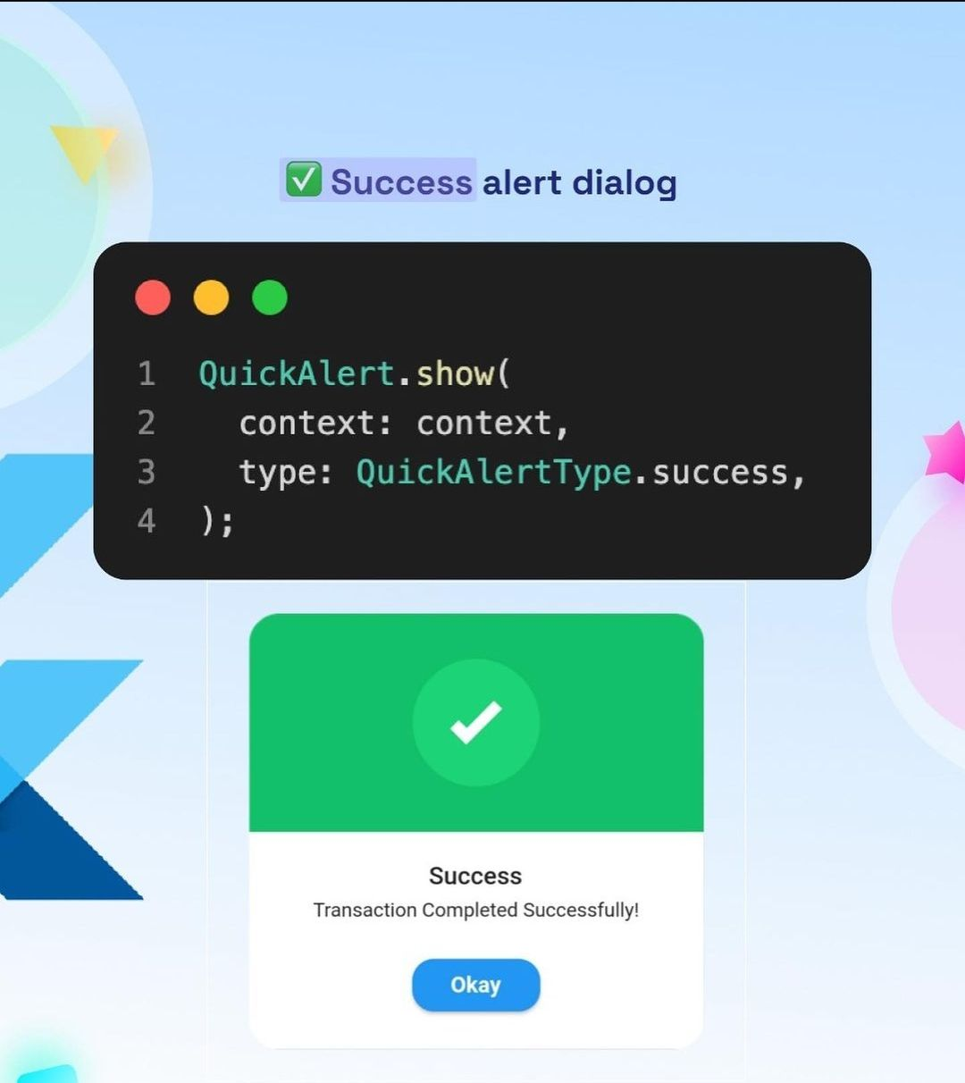
QuickAlert.show(
   context: context,
   type: QuickAlertType.success,
   text: 'Transaction Completed Successfully!',
  );

Código
QuickAlert.show(
   context: context,
   type: QuickAlertType.error,
   title: 'Oops...',
   text: 'Sorry, something went wrong',
  );

Código
QuickAlert.show(
   context: context,
   type: QuickAlertType.warning,
   text: 'You just broke protocol',
  );
Código
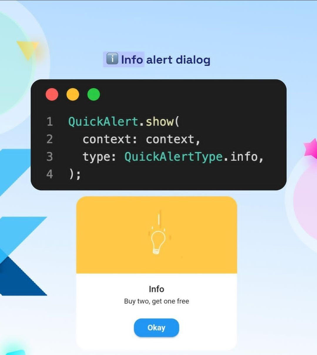
QuickAlert.show(
   context: context,
   type: QuickAlertType.info,
   text: 'Buy two, get one free',
  );
Código
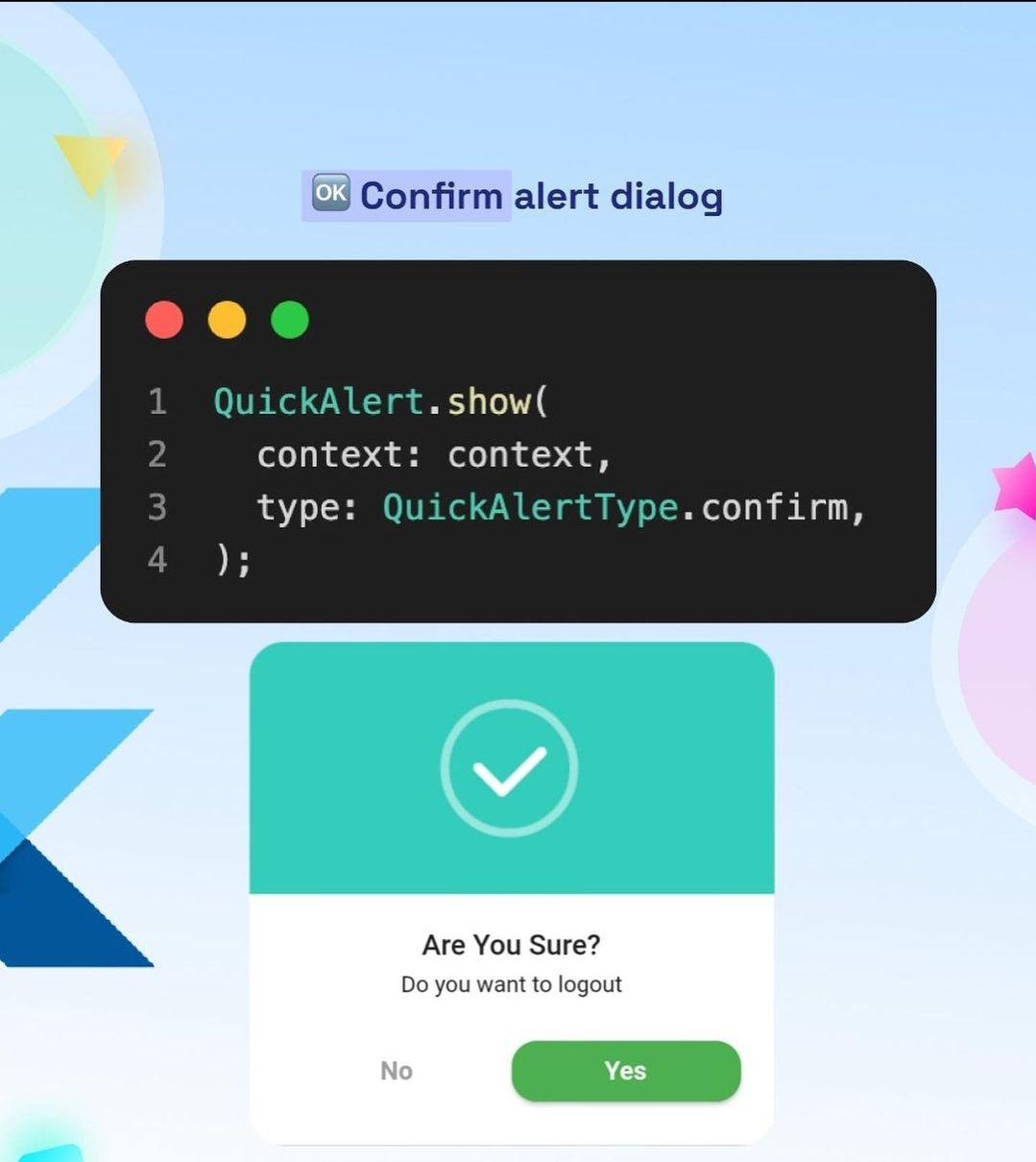
QuickAlert.show(
   context: context,
   type: QuickAlertType.confirm,
   text: 'Do you want to logout',
   confirmBtnText: 'Yes',
   cancelBtnText: 'No',
   confirmBtnColor: Colors.green,
  );

Código
QuickAlert.show(
  context: context,
  type: QuickAlertType.loading,
  title: 'Loading',
  text: 'Fetching your data',
 );
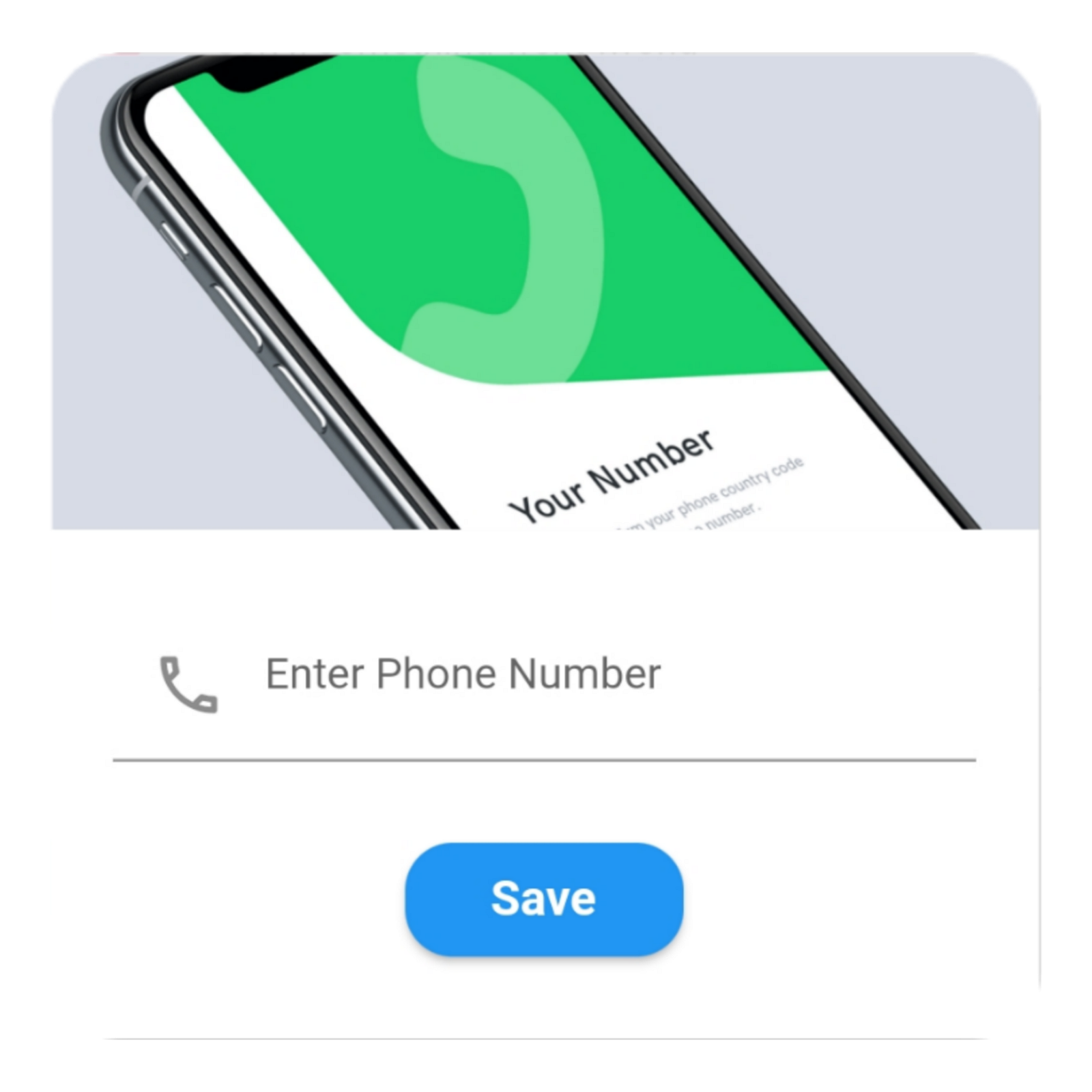
Um Custom Dialog
Código
QuickAlert.show(
    context: context,
    type: QuickAlertType.custom,
    barrierDismissible: true,
    confirmBtnText: 'Save',
    customAsset: 'assets/custom.gif',
    widget: TextFormField(
    decoration: const InputDecoration(
       alignLabelWithHint: true,
       hintText: 'Enter Phone Number',
       prefixIcon: Icon(
       Icons.phone_outlined,
       ),
      ),
      textInputAction: TextInputAction.next,
        keyboardType: TextInputType.phone,
        onChanged: (value) => message = value,
      ),
      onConfirmBtnTap: () async {
       if (message.length < 5) {
        await QuickAlert.show(
         context: context,
         type: QuickAlertType.error,
         text: 'Please input something',
        );
        return;
      }
      Navigator.pop(context);
       await Future.delayed(const Duration(milliseconds: 1000));
       await QuickAlert.show(
        context: context,
        type: QuickAlertType.success,
        text: "Phone number '$message' has been saved!.",
       );
      },
    );
   },
   title: 'Custom',
   text: 'Custom Widget Alert',
   leadingImage: 'assets/custom.gif',
  );
QuickAlert Options 📖
These are the options available in QuickAlert Class.
| Attribute | Data type | Description | Default Value |
|---|---|---|---|
| context | BuildContext | @required BuildContext | N/A |
| type | QuickAlertType | @required – Type of alert dialog, ex: QuickAlertType.success for success dialogs | Null |
| title | String | Set a custom title for dialog | Based on the QuickAlertType selected |
| text | String | Set the description text of the dialog. | Null |
| widget | Widget | Set custom widget of the dialog. | Null |
| confirmBtnText | String | Text of confirm button | ‘Okay’ |
| confirmBtnTap | Function | Function that handle click of confirm button | () => Navigator.pop(context) |
| confirmBtnColor | Color | Color of confirm Button | Colors.blue |
| showCancelBtn | bool | Determines if cancel button is shown or not | false |
| cancelBtnText | String | Text of cancel button | ‘Cancel’ |
| cancelBtnTap | Function | Function that handle click of cancel button | () => Navigator.pop(context) |
| barrierDismissible | bool | Dismiss dialog on touch overlay | true |
| animType | QuickAlertAnimType | Type of dialogue enter animation | QuickAlertAnimType.scale |
| confirmBtnTextStyle | TextStyle | Confirm button text theme | TextStyle(color: Colors.white, fontWeight:FontWeight.w600,fontSize: 18.0) |
| cancelBtnTextStyle | TextStyle | Cancel button text theme | TextStyle(color: Colors.grey, fontWeight:FontWeight.w600,fontSize: 18.0) |
| backgroundColor | Color | Color of dialog background | Colors.white |
| titleColor | Color | Color of title | Colors.black |
| textColor | Color | Color of text | Colors.black |
| barrierColor | Color | Color of Barrier | Null |
| customAsset | String | Asset path of your custom asset | Null |
| autoCloseDuration | Duration | Determines how long the dialog stays open for before closing | Null |
| width | double | Dialog width | MediaQuery.of(context).size.shortestSide |


")


